Project Overview
ServiceNow approached me to modernize and simplify their Product Development Life Cycle (PDLC) visualization. The original diagram, while informative, had grown visually complex and challenging to interpret—especially for stakeholders less familiar with the lifecycle stages.
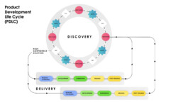
The goal was to deliver a solution that clarified the process, emphasized the strategic value of Discovery and aligned the aesthetic with ServiceNow’s design system.
The Challenge
Feedback from internal leadership and survey responses revealed key issues in the original PDLC diagram:
-
Lack of clarity: Repetitive Discovery stages (multiple Understand-Ideate-Test loops) made the process feel cluttered and confusing.
-
Directional confusion: The flow of arrows moving in multiple directions (clockwise and counterclockwise) disrupted understanding.
-
Overcomplicated layout: Duplicated delivery rows diluted the sense of cohesion.
-
Disconnected emphasis: Discovery felt secondary, rather than integral to Delivery.
-
Inconsistent branding: The previous design lacked alignment with ServiceNow’s Horizon system and visual tone.
The Solution
1. Simplified structure
The new visualization unifies Discovery and Delivery into a single, continuous loop—reflecting the iterative, cyclical nature of the PDLC. I eliminated redundancy in the Discovery loop, reducing multiple Understand-Ideate-Test cycles to one seamless iteration.
2. Visual clarity & flow
Introduced a unified directional flow with clearly marked stages and a smooth transition from Discovery to Delivery. This helps viewers understand that Discovery is not separate—but an equal, ongoing part of the process.
3. Design language & branding
The updated look integrates the ServiceNow design system, with clean typography, purposeful use of brand colors (blues for Discovery, greens for Delivery), and a sleek, modern interface. Every visual choice was made to reflect ServiceNow’s product-forward and user-centered ethos.

