Theme Development
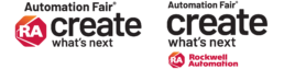
Logos
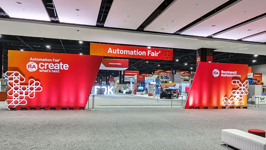
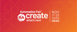
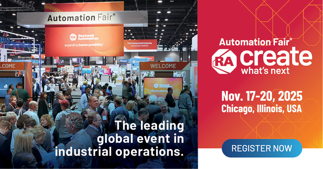
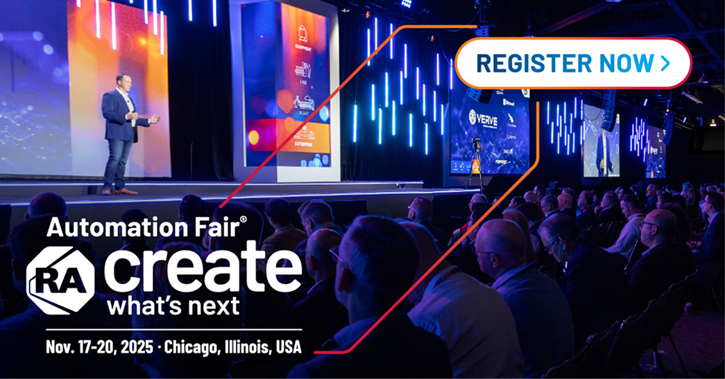
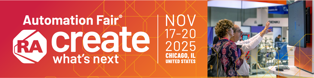
This logo reflects Rockwell Automation’s strong, forward-looking brand by emphasizing action, clarity, and innovation. The bold use of “create” puts focus on doing—not just imagining—aligning with Rockwell’s role as a builder of real-world industrial solutions. The clean, modern design reinforces trust, technical leadership, and momentum. By integrating Create What’s Next into the Automation Fair identity, the logo positions the event as a launchpad for progress. It invites customers and partners to actively shape the future together, connecting Rockwell Automation’s legacy with its vision for what comes next.
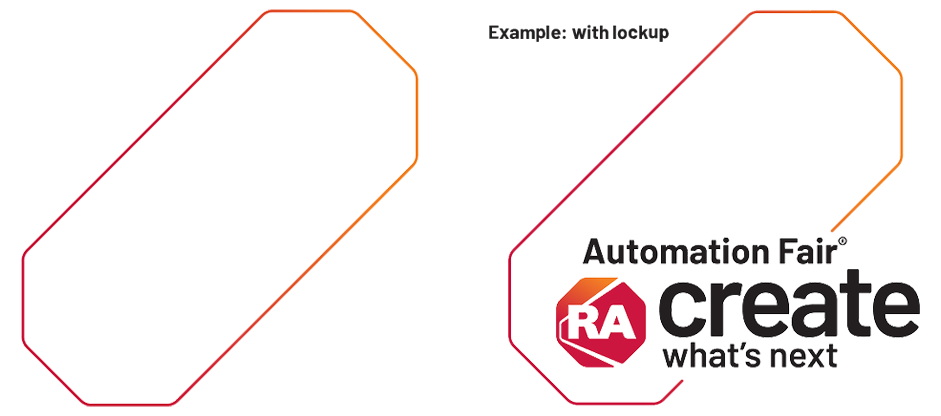
Framing device
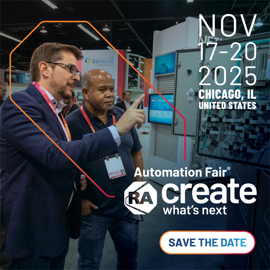
Frames are a consistent visual thematic device that anchors key content and area of focus. The shape can be elongated, shortened and flipped vertically and horizontally but never tilted. Framing device can be combined with the Automation Fair logo lockup and/or date lockup or be used as a stand alone frame only. Do not include long form paragraph or copy that’s not approved.

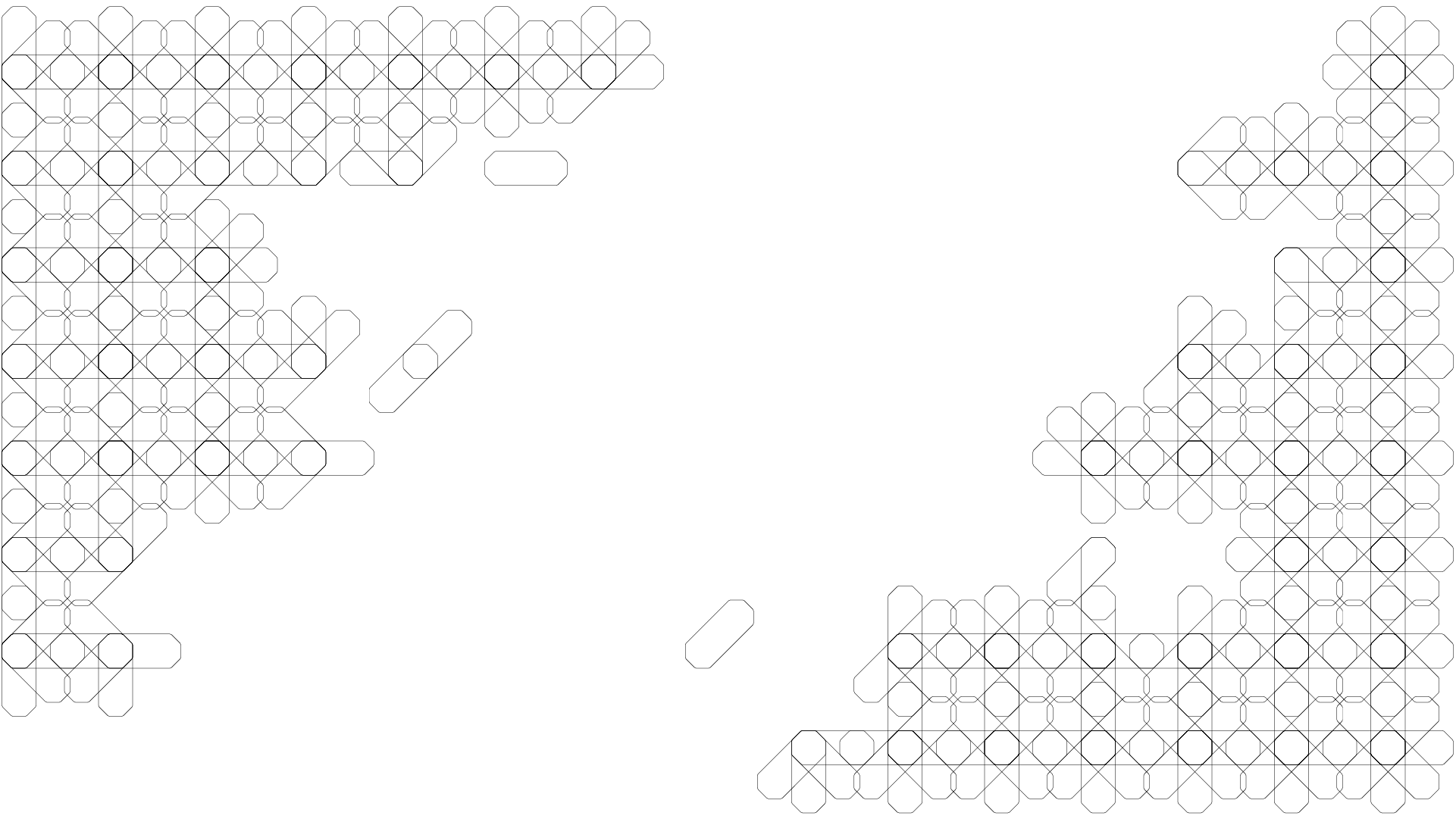
Pattern Texture
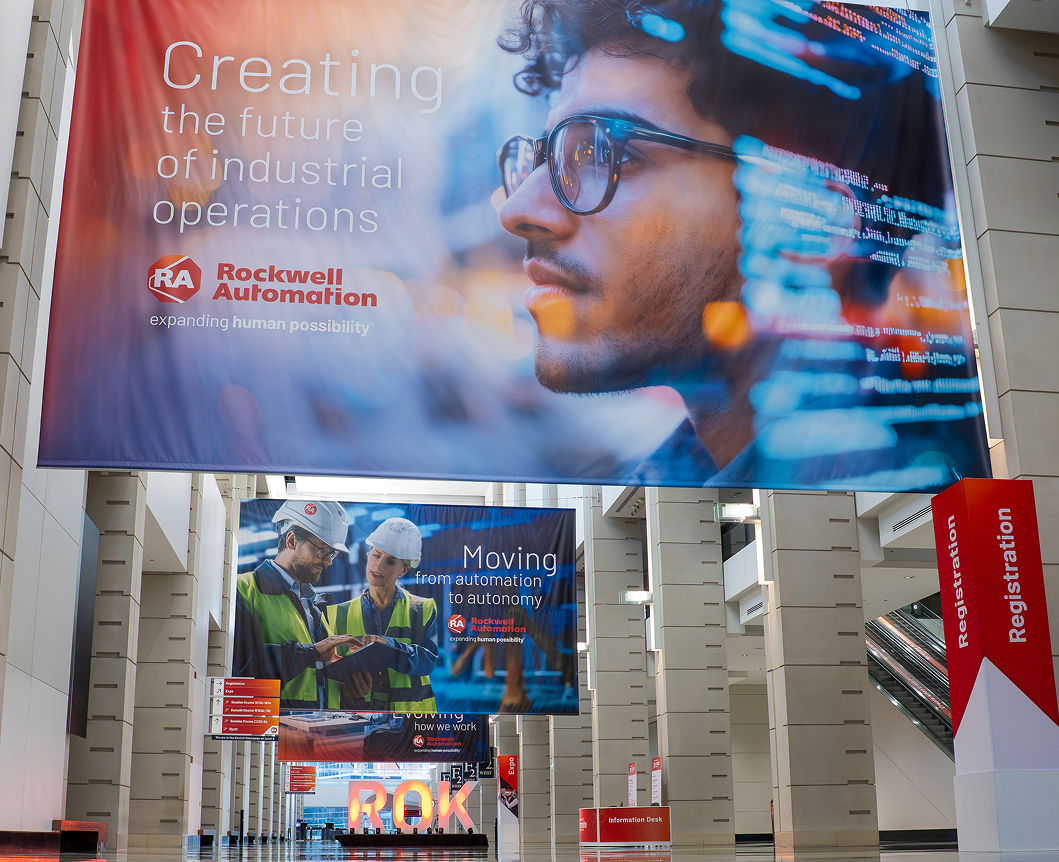
A visual symbol of connection, precision, and collaboration. The intricate pattern provides movement and energy while paying homage to the iconic octagon RA logo. Use this textural element consistently at various scales to drive consistency amongst deliverables. Adopt a stroke weight that best compliments the solution and allows the texture to be visible but not distracting.
blueprint texture
Background gradient

Gradient overlay

Example 1

Example 2

Digital
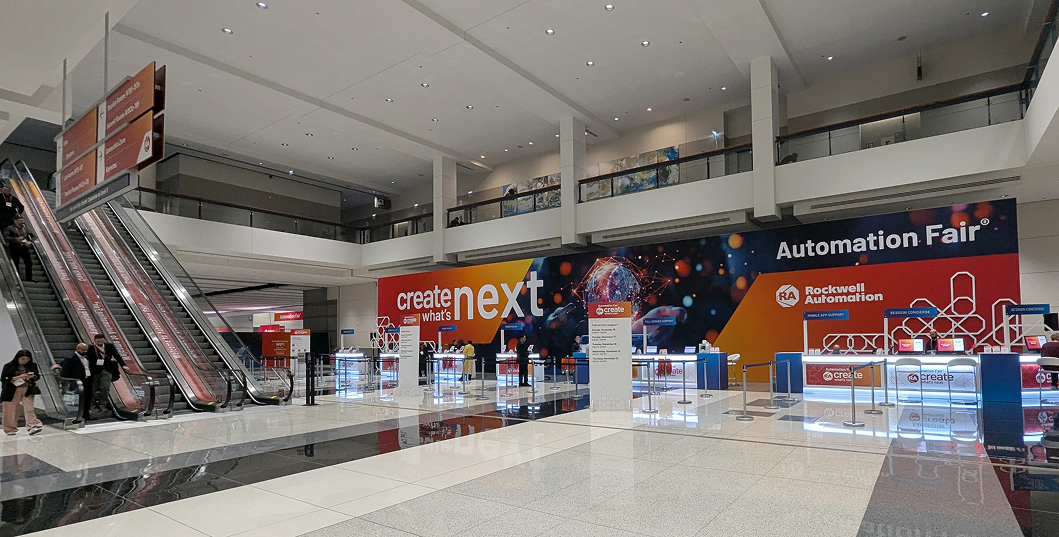
Expo design